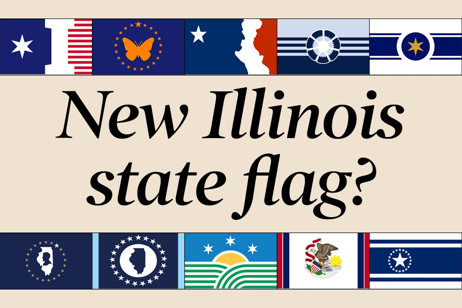
Illinois could soon get a new state flag. Voting is now open for Illinois residents to select from one of 13 designs. Ten new designs were selected by the Illinois flag commission from nearly 5,000 submissions for the state flag redesign contest. The other three flags are the current state flag, the flag’s centennial design, and the design made to celebrate Illinois’s 150th anniversary.
The prospect of a redesigned flag was put into motion when Gov. J.B. Pritzker signed a law creating the Illinois Flag Commission to help decide what the state flag should represent and to help select a flag that exemplifies the values of Illinois and its people.
History of the Illinois flag:
Illinois became the 21st state in 1818, but the first official flag — the Great Seal of Illinois on a plain white background — was established in 1915 after winning a similar design contest.
The state’s second and current flag was created in 1969, when, due to concerns about the flag’s recognizability, the word “Illinois” was included under the seal.
Flag designs
Flag 1
This flag has a blue area on its left side with a six-pointed white star to represent Chicago, 21 red and white stripes on its right to represent Illinois being the 21st state, and white space between the two that creates a capital “I” to represent Illinois.
Abhay’s takes: Every resident knows that there are two symbols that represent every single city in the state of Illinois: the city of Chicago, and the number 21. Do you really need to think about anything else to represent the state? The patterns are fine and genuinely quite nice, but doesn’t this just truly represent every single aspect of the entire state so well? No, not really.
Flag photo credits: https://www.ilsos.gov/special/IFC/10finalists.pdf
Flag 2
At the center of this flag a monarch butterfly, the state butterfly, is surrounded by 21 stars to represent Illinois being the 21st state.
Abhay’s takes: The contrast between the navy background and the monarch butterfly in this design is really pretty. Though, it was an interesting choice to have the flag center around what is also the state insect of Texas. As well as the state insect of Idaho, which also just so happens to be the state insect of Alabama. The design is nice and simple, but can a nonexclusive butterfly and 21 stars really represent Illinois?
Flag photo credits: https://www.ilsos.gov/special/IFC/10finalists.pdf
Flag 3
A blue area on its left side forms a profile silhouette of Abraham Lincoln, who appears to be looking toward a red area on the design’s right side that takes the shape of Illinois’s western border. The white space that splits the two areas is a nod to the French flag.
Abhay’s takes: This flag works. You can’t really see the symbols at first, but the design is simple in a good way. It solely focuses on two of Illinois’s most iconic symbols, has a color palette that matches many state flags, and overall forms a flag that is subtle but distinctly Illinois.
Flag photo credits: https://www.ilsos.gov/special/IFC/10finalists.pdf
Flag 4
At the center of this flag is a depiction of the state flower, the violet, composed of a 21-pronged gear to represent Illinois’s industrial foundations and seven corn kernels to represent the state’s agricultural foundations.The flag’s four dark blue bars represent the Mississippi River, the Ohio River, the Chicago River/Illinois River and Lake Michigan.
Abhay’s takes: I like it. Though the design is a bit over-complicated compared to the other finalists, it is very cleverly designed and it subtly integrates several aspects of Illinois into a complex design that’s nice to look at.
Flag photo credits: https://www.ilsos.gov/special/IFC/10finalists.pdf
Flag 5
The gold star at the center of this flag is meant to represent the richness of the land and its people. The navy circle that surrounds the star is a nod to Lincoln’s top hat from above, and the navy lines represent lake Michigan.
Abhay’s takes: This is a really generic design. It has a six-pointed star, and other symbols are represented by abstract shapes, but with no other visible Illinois symbols this flag really feels disconnected from the state.
Flag photo credits: https://www.ilsos.gov/special/IFC/10finalists.pdf
Flag 6
The center of this flag features a profile silhouette of Abraham Lincoln and the outline of the state, both of which are surrounded by a ring made up of 20 gold stars and 1 larger white star at the top right that represents Chicago. The blue background represents the state’s blue-collar attitude, and gold stars represent the state’s prairies and agriculture.
Abhay’s takes: This flag’s key symbols genuinely represent Illinois really well, but the flag is so dark and dull that it just feels boring as a whole.
Flag photo credits: https://www.ilsos.gov/special/IFC/10finalists.pdf
Flag 7
The center of this flag features the outline of Illinois at the center of a white circle, which is meant to represent being a geographical and transportational center of the country. Alongside this central symbol, which is surrounded by 21 stars, the blue sides of the flag represent the Mississippi River and Lake Michigan.
Abhay’s takes: This flag has one symbol: Illinois itself. While the choice of symbol isn’t the most creative, the symbol itself is well emphasized and the flag as a whole actually has some really nice contrast that makes for a very enjoyable design.
Flag photo credits: https://www.ilsos.gov/special/IFC/10finalists.pdf
Flag 8
The bottom of this flag consists of 21 green and white stripes, which represent Illinois’ agricultural roots and prairie origins. The center features a half-sun on the horizon (also featured on the current flag) and around the sun are three six-point stars, whose 18 points represent the state’s founding in 1818.
Abhay’s takes: This design is uniquely bright. It takes iconic and historic symbols of Illinois, and instead of just putting them alone in the center of an empty flag, it makes them the entire flag. This flag is more bold than most other competing designs, and it’s more interesting too.
Flag photo credits: https://www.ilsos.gov/special/IFC/10finalists.pdf
Flag 9
This flag consists of the state seal, displayed in a similar way to the current flag, on a white background with blue and red vertical stripes on the sides of the design.
Abhay’s takes: Did we really wait 54 years to add four blue and red stripes to the flag? Sure it’s more visually interesting than the current flag, but it feels like a really boring choice.
Flag photo credits: https://www.ilsos.gov/special/IFC/10finalists.pdf
Flag 10
This flag consists of three blue stripes on a white background; the two smaller stripes represent the state’s various rivers, and the larger stripe represents Lake Michigan. On the larger stripe, a large white star surrounded by 20 other white stars represents Illinois as the 21st state.
Abhay’s takes: This flag, while representing many interesting symbols, shows approximately none of them. It feels generic, like you could remove a star and it would suddenly be a candidate for the Mississippi state flag.
Flag photo credits: https://www.ilsos.gov/special/IFC/10finalists.pdf
Flag photo credits: https://www.ilsos.gov/special/IFC/10finalists.pdf